Our Videos
Guidelines for creating videos that complement our brand.
Branded video content
The intention of these guidelines is to ensure consistency across our video output. We want to make sure that our video assets contribute to the University's strong and consistent visual brand identity.
If you have any queries about implementing these guidelines, contact the Creative team at creativeassets@ncl.ac.uk.
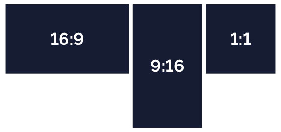
Video ratios
We use video content produced for the University across a variety of channels, each with their own optimum aspect ratios.
When planning a production, consider the most appropriate ratio for your chosen delivery method.
16:9
Widescreen format for YouTube, plasma screens, presentations, some digital display advertising.
9:16
Vertical format for Instagram Stories and Reels, Snapchat, some digital display advertising.
1:1
Square format for Facebook, Twitter (X)
Branded elements
There are many branded elements available for you to download from our Photo Library.
Logo
All branded videos should use the full colour or full colour reversed out University logo as a digital on screen graphic.
The PNG file in our branded elements should fit across any aspect ratio video and resolution to avoid any potential errors. You should position this top right, and at a suitable size for the video’s aspect ratio. Use 100% opacity, rather than reduced.
Keep any logo animations in your videos simple. Avoid bouncing, overshoot, rotation, and glitch effects.

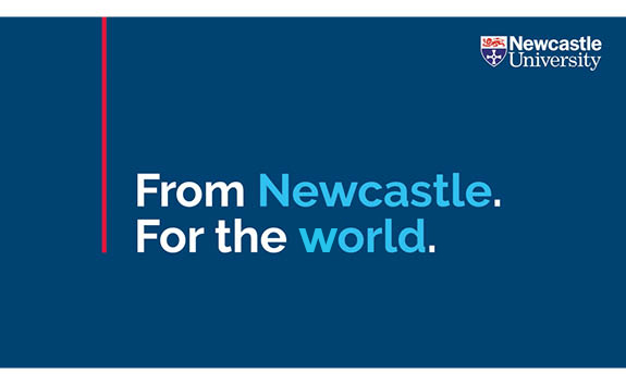
End cards
All external videos must finish with a branded end card featuring the University logo and the line 'From Newcastle. For the world'. If you require a variation to this end card, contact the Creative team at creativeassets@ncl.ac.uk.
Subtitles
All videos should be delivered with appropriate subtitles in an .srt file to be uploaded to the delivery platform alongside the master video file.
In some instances the subtitles may need to be 'burnt on' before delivery. In these situations subtitles should be:
- a white font on black background
- in the brand font Derailed
- a suitable font size for the video’s aspect ratio
Typography
If using typography in your videos, you should adhere to our typography guidelines. Our brand font is Derailed. It comes in seven recommended weights, all with their own italic version.
When using Derailed in a video, please consider how different weights will work together: use the heavier weights for headings and titles, and the lighter weights for body copy and sub-headers.
There is no 'right way' to combine fonts, but we advise using fonts that are at least two weights apart to create contrast.
You should use sentence case at all times, and avoid using all caps.
Video openings
You should avoid using opening title cards or fade ins. Instead, the first frame of your video should be a full frame shot to maximise visual effect and engagement.
Further advice
For further advice around video production, see our video content creation recommendations or contact the Creative team at creativeassets@ncl.ac.uk.