Typography
Reinforcing our brand
Typography reinforces our personality and brand, and helps to deliver our messages with style and impact.
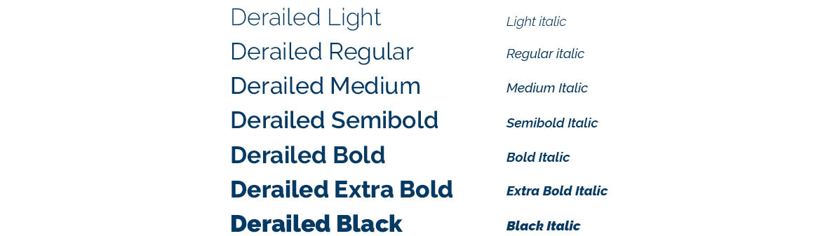
In 2019, the University introduced Derailed, a versatile, elegant, sans serif type. We use this across all printed and digital marketing materials.
Helvetica typeface is the lead typeface for the body font on our website.
Seven different weights (plus italic versions), are available to use across all materials. They allow flexibility, but also create consistency across materials.
Typeface guidance
Specific guidelines to keep in mind when using Derailed:
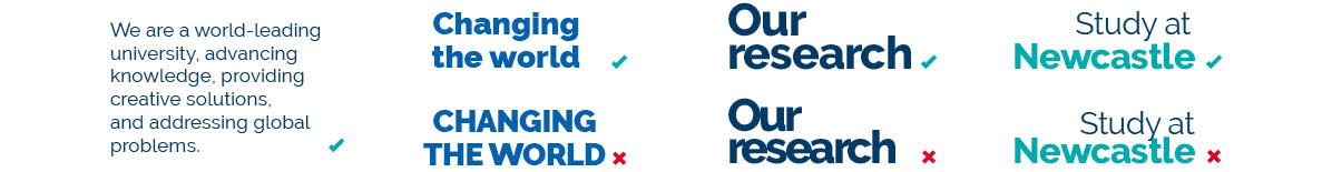
- use sentence-case wherever possible to ensure maximum readability
- titles should also use sentence case and not all caps to ensure accessibility
- letter spacing can be tightened where required, but do not exceed -20pts
- line spacing should ensure that text is easy to read
Where can I get Derailed?
Derailed is installed on all Windows desktops across campus.
It is also available for Mac OS – please contact NUIT Support to raise a request to have the font installed on your Mac desktop.
Web typeface
The main fonts in use on our University website are:
-
Derailed. This is mainly used for titles and appears on components such as dual panels and key messages
-
Helvetica Neue / Hevetica / Arial. There is no main body text style specified, but first on the list if available on a user’s computer is Helvetica Neue