Accessibility
Ensuring accessibility is all about removing barriers to our content, whether it's shared in printed or digital formats.
Why accessibility matters
Key statistics show why we must consider accessibility needs for our audiences:
- Dyslexia International says around 10% of the population experience dyslexia (700 million people)
- the estimated number of visually impaired people in the world is 285 million (39 million blind and 246 million with low vision)
- one in 12 men and 1 in 200 women worldwide are colour blind (300 million people)
- more than 5% of the world's population (466 million people) have disabling hearing loss
We should not discriminate against users with these issues by providing inaccessible content. We should not exclude these people from engaging with our research, becoming students here or working with us.
Colour contrast
Colour contrast between text and background is important across all design, both print and digital. Levels of contrast affect some people’s ability to perceive information (in other words to be able to receive the information visually).
The Web Content Accessibility Guidelines (WCAG) recommend minimum levels for colour contrast between text and background. View our visual identity guidelines for more information about recommended levels of contrast.
It’s also important that you don’t rely upon colour to convey a meaning, as this excludes those who can’t perceive colour. Make sure you combine use of colour with text, labels, or symbols.
Use of colour tints can be helpful when conveying complex information in formats such as charts and tables, as this makes the content easier on the eye. Be sure to use the tints as specified in the colour palette and be mindful of contrast.
Useful web tool
Colour Contrast Analyser (Google Chrome extension) takes a screenshot of the page you’re on and analyses it using the WCAG formula.
If the text is perceivable once the 'mask' is in place, then there are no colour contrast issues.
If you’re struggling to make out the words with the 'mask' applied, then some of your audience may struggle with the colour contrast on your page.
You can download this free web tool to test any pages you're working on, to ensure accessibility guidelines are being met.
Text and accessibility
Effective text and use of font is essential for accessibility. Text should be an appropriate size and given appropriate spacing to ensure legibility. This includes considering space between letters (kerning). For example, you need to be sure that letters such as ‘r’ and ‘n’ aren’t set too close to one another, to look like an ‘m’.
Left aligned text is also more accessible to a user with dyslexia or a visual impairment.
Whilst images and videos are important complementary content, you shouldn’t use an image or a video in place of words. Images that try to convey lots of written detail won't be accessible to partially sighted or blind users. When considering web content, they likely won't legibly display on mobile devices either.
Capitals
Keep capitals to a minimum (nouns and page titles only please)
People with cognitive impairments can process lower case letters more easily, due to their distinctive shape. Capitals don't offer such distinction, making them more difficult to read.
Italics
We don't use italics on the website. Italics corrupt the legibility of the font for the user.
Having a perceivable font is critical to users with cognitive or visual impairments.
Bold
We do use bold but only sparingly. It helps scan readers to quickly pick up keywords and phrases from your content.
But using too much bold doesn’t help anyone. It doesn’t aid scan reading. It just hurts users’ eyes and makes content more difficult to read.
Useful web tool
Use SEObility to check use of bold. It gives you an indication of how much bold you can use on a page and whether you’ve used too much.
For capitals and italics, there are no tools available to check pages. Really it’s a judgement call by eye.
You should avoid sentences with capitals and italics as a general rule, as they will be less accessible.
Screen readers also read capitalised letters one at a time, as if they were acronyms. A detail content editors must bear in mind.
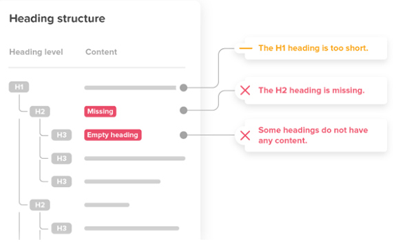
Structure and headings
Cluttered and ‘busy’ designs can pose a barrier to some audiences, meaning your content is less accessible. Maintaining a clear and simple structure is the best way to avoid making this mistake. Logical headings are key to creating this structure, in both print and web content.
When creating web content, remember that web browsers, plug-ins, and assistive technologies can use headings to provide in-page navigation, so it’s important that they work effectively.
Nest headings by their rank (or level). The most important heading has the rank 1 (<h1>), the least important heading rank 6 (<h6>).
Headings with an equal or higher rank start a new section. Headings with a lower rank start new subsections that are part of the higher ranked section. You should avoid skipping heading ranks where possible as it can confuse users. Make sure that an <h2>is not followed directly by an <h4>, for example.
It is ok to skip ranks when closing subsections, for instance, an <h2> beginning a new section, can follow an <h4> as it closes the previous section.
Useful web tools
Both Silktide and SEObility flag empty headings, while the latter highlights incorrect heading structure.
Good use of heading structure can add form and organisation to a page. This will make it much easier for users to scan the page.
Web users scan pages to save time, and headings help them glean the content themes quickly.
Screen readers
Blind, partially-sighted and, sometimes, dyslexic users rely on screen readers to help them understand the content on a web page.
Using a screen reader in building a page can highlight:
- missing image/video alt tags
- problems with code stopping important content being available audibly
- long sentences that are too convoluted to understand
- where links might not be descriptive enough for the user
- problems with the layout and structure of the page that would hamper navigation
- whether links are identified
Useful web tool
Silktide Disability Toolbar and Screen Reader Simulator not only reads the content out for you, but displays it and includes the context.
Descriptive web links
Poor link text hurts usability, SEO and accessibility. Links must therefore clearly explain where they will take users.
The visually-impaired use a screen reader. They can get an overview of a page by tabbing through links on a page. But only if those links are descriptive.
Link text like 'Click here' doesn’t provide the information they need to inform that action. Search engines use the anchor text to add context about the page or document.
Useful web tool
Silktide Disability Toolbar and Screen Reader Simulator
Silktide will identify links that aren’t descriptive. You can find them under the 'Ensure links explain their purpose' item in the platform’s accessibility section checklist.
You can also test how descriptive links are. Run them through the screen reader simulator and listen to what’s read back to the user.
Image alt tags
An alt attribute specifies the text that displays when an image can't load, e.g. due to server problems or a weak internet connection.
This is also very helpful for blind people because screen readers read this out. It also helps Google with the thematic classification of an image.
It is especially important that this short text reflects the content of an image and contains the most important keywords.
If an image contains no alt text, a screen reader reads out the word 'link' to the user. They have no indication about what it takes them to.
Useful web tool
Silktide will flag any images that it can see on the page requiring alt text, based on the context of their use. It will ignore decorative images, but not those that prompt an action by the user.
Supplementary content (online content)
Don't replace text
The number of words on a page is important for SEO, as too few words can affect the ranking of a page.
Don't use an image or video in place of words. Images that try to convey lots of written detail won't be accessible to partially-sighted or blind users. They likely won't legibly display on mobile devices either.
An image should support written content, with alternative text (alt text) for screen readers and search engines.
Consider your audience
Video embeds from YouTube can be inaccessible in certain countries (China, Sudan etc). Users from countries with poor internet connections may also struggle.
Video requires subtitles for the hearing-impaired. It is supplementary content.
Video embeds
To ensure accessibility, videos should never convey information in visual-only format. If information is purely visual, it should be subtitled.
Scripted video content should carry closed captions for those who are deaf or hard of hearing.
Our website usually uses YouTube to embed videos, which means that closed captions are provided. It also loads an image rather than the video onto the page, so page load is optimised.
Consider your audience
Video embeds from YouTube can be inaccessible in certain countries (China, Sudan etc). Users from countries with poor internet connections may also struggle.
Video requires subtitles for the hearing-impaired. It is supplementary content.
Useful web tool
Iframely is good for embedding videos with closed captions. The video will only load and play fully when clicked, which reduces page load times.
Responsive web design
Mobile traffic now exceeds desktop traffic. Google penalises websites which don't support mobile.
Allowing users to zoom in to mobile dimensions is also an accessibility concern, and WCAG 2.1 onwards requires this.
A website should use responsive web design. Specifically, it should support mobile devices as narrow as 320 CSS pixels without scrolling in two dimensions.
This is equivalent to the screen of an iPhone 5.
Useful web tool
Under Accessibility in Silktide, you’ll find a check called 'Design all pages for mobile'.
Optimising PDFs
PDFs aren’t ideal in terms of accessibility, or for mobile users, so we would often advise to create a webpage rather than a PDF. However, sometimes PDFs are useful as downloadable assets, or to showcase particular content online.
You can make documents more accessible via Adobe Acrobat. This won’t necessarily help with mobile, though there are options from third-parties to create mobile versions.
Useful web tools
Optimise your PDF by compressing it at I Love PDF and upload at less than 1MB. This level of compression is ideal for more text-based PDFs that don't contain too many high resolution images.
Showcase your PDF by using a service like Yumpu, allowing you to add metadata to enhance findability. It also provides analytics for the views of your publications.
You can then publish and embed using Iframely.